SIÉMAN WINE
BrandingPackagingIllustration
_
Role: Creative Director & Design & Illustration
Year: 2021
_
Illustration: Alessandra Myers
Year: 2021-2023
Press: Packaging of the world
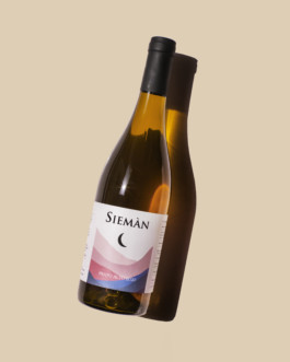
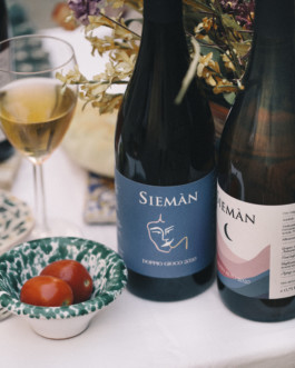
Wine Labels Redesign for the Italian natural wine company Sièman, which exports their wines in the EU, US & Japan. You can find their wines from a Michelin Star Restaurant to the small wine shops with younger audiences.
The project aimed to position Sièman in a more classy & sophisticated market, with a look to the Italian tradition (i.e. the use of the typeface Trajan on the logo emphasizes that), without losing the young, fresh & playful personality – Sièman brand is only 7 years old.
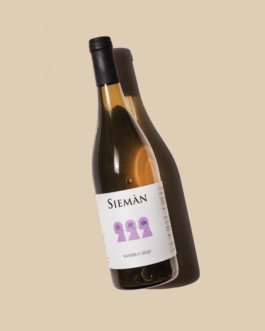
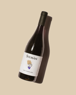
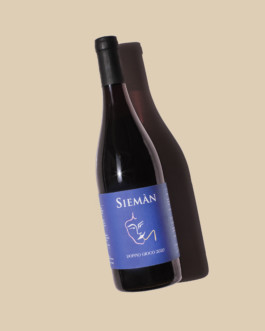
From the conception to the final design, the illustrative style felt more inclined to address the new repositioning. With the illustrations (inspired by Matisse’s graphical drawing), we aimed to create visual metaphors & connections with specific names of the bottles. For example, “Doppio Gioco”, literally “double play”, shows 2 humans kissing each other, “Saverlo” which means Knowledge in Veneto dialect, showing three human brains connections (symbolize the three brothers, owners of Sièman).


SIÉMAN WINE
BrandingPackagingIllustration
_
Role: Creative Director & Design & Illustration
Year: 2021
_
Illustration: Alessandra Myers
Year: 2021-2023
Press: Packaging of the world
I redesigned wine labels for Italian natural wine company Sièman, blending a classy, traditional feel with a youthful, playful personality. Inspired by Matisse, the illustrations create metaphors connecting bottle names, enhancing their appeal in sophisticated global markets.
Read More +
Wine Labels Redesign for the Italian natural wine company Sièman, which exports their wines in the EU, US & Japan. You can find their wines from a Michelin Star Restaurant to the small wine shops with younger audiences.
The project aimed to position Sièman in a more classy & sophisticated market, with a look to the Italian tradition (i.e. the use of the typeface Trajan on the logo emphasizes that), without losing the young, fresh & playful personality – Sièman brand is only 7 years old.
From the conception to the final design, the illustrative style felt more inclined to address the new repositioning. With the illustrations (inspired by Matisse’s graphical drawing), we aimed to create visual metaphors & connections with specific names of the bottles. For example, “Doppio Gioco”, literally “double play”, shows 2 humans kissing each other, “Saverlo” which means Knowledge in Veneto dialect, showing three human brains connections (symbolize the three brothers, owners of Sièman).
