BEAT81
BrandingDigital
_
Role: Senior Designer
Year: 2020
Rebranding for the fitness Berlin-based startup BEAT81.
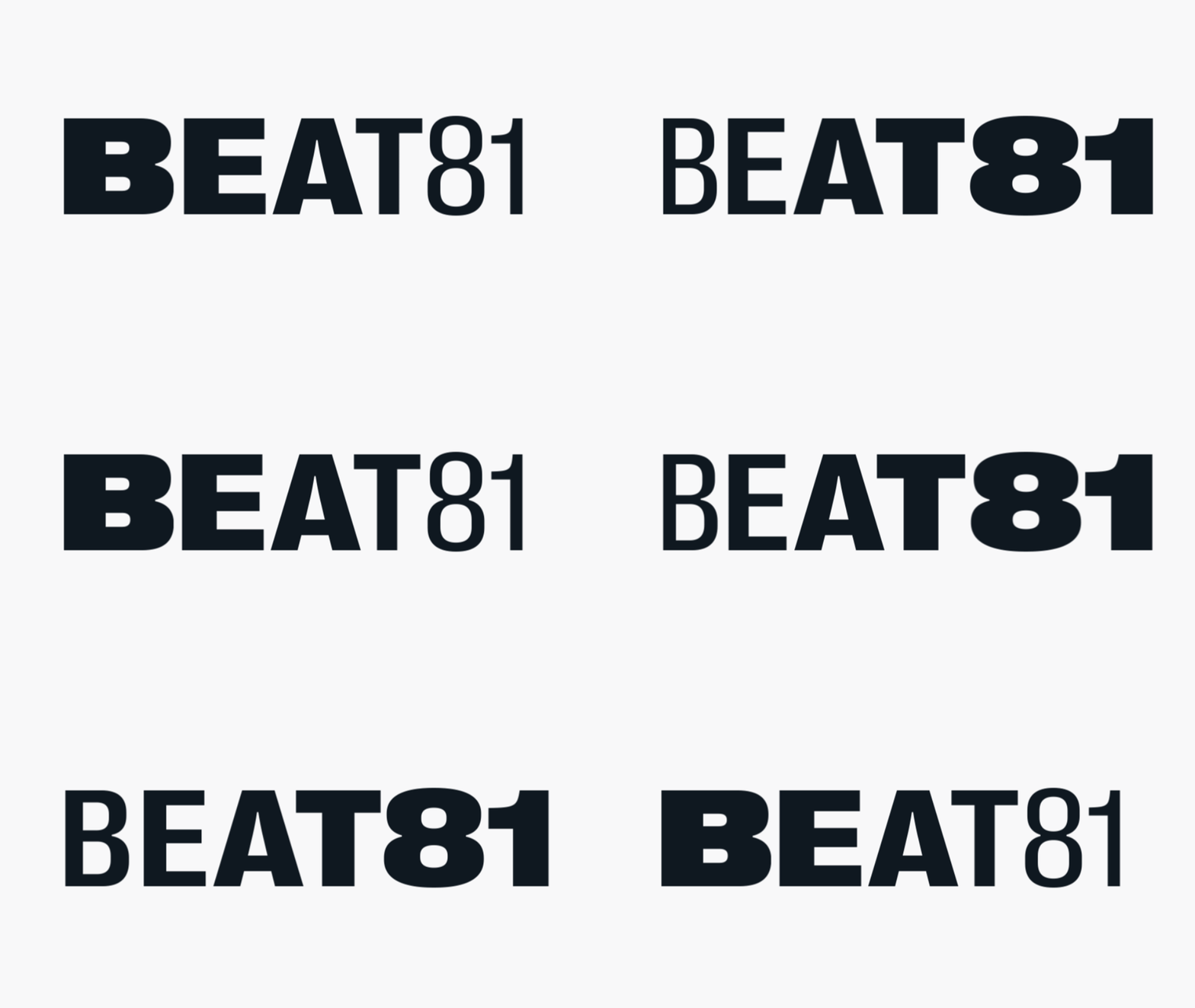
The BEAT81 wordmark is inspired by street culture and guerrilla messaging. The expansion and compression represent the beat of the heart and street. Dynamic and flexible, its elements represent the energy of our workouts and the inclusivity of our community. The space surrounding the 81 captures the eye, highlighting our unique trait. It’s the 81 that separates us from the rest.
A fluid design, the logo progresses from the expanded B to the compressed 81. The typeface blends the neutrality, and functionality, of a classic grotesque font but with fine details and smooth curves. White space around the 81 attracts attention making it more readable.
Bold fonts and editorial inspired layouts are the main drivers of all BEAT81 asset composition. The texts are short and to the point. The images capture our world. Always remember who we represent; our community, coaches and customers. We aren't glossy, we’re real and don’t need to overwork it. Simplicity always screams louder than complexity.
Across each example touchpoint, we’re both bold and captivating. Solid fonts and raw imagery is offset by relatable and inspiring messaging. True, honest, strong and real, each execution upholds our values, using various combinations of our branding dynamics.


BEAT81
BrandingDigital
_
Role: Senior Designer
Year: 2020
In 2020, I rebranded Beat 81, drawing inspiration from street culture. The dynamic wordmark symbolizes heartbeats and community energy, with bold, simple fonts and real, raw imagery reflecting inclusivity and strength, ensuring our unique identity stands out.
Read More +
Rebranding for the fitness Berlin-based startup BEAT81.
The BEAT81 wordmark is inspired by street culture and guerrilla messaging. The expansion and compression represent the beat of the heart and street. Dynamic and flexible, its elements represent the energy of our workouts and the inclusivity of our community. The space surrounding the 81 captures the eye, highlighting our unique trait. It’s the 81 that separates us from the rest.
A fluid design, the logo progresses from the expanded B to the compressed 81. The typeface blends the neutrality, and functionality, of a classic grotesque font but with fine details and smooth curves. White space around the 81 attracts attention making it more readable.
Bold fonts and editorial inspired layouts are the main drivers of all BEAT81 asset composition. The texts are short and to the point. The images capture our world. Always remember who we represent; our community, coaches and customers. We aren't glossy, we’re real and don’t need to overwork it. Simplicity always screams louder than complexity.
Across each example touchpoint, we’re both bold and captivating. Solid fonts and raw imagery is offset by relatable and inspiring messaging. True, honest, strong and real, each execution upholds our values, using various combinations of our branding dynamics.


