Siéman Beer
BrandingPackaging
_
Role: Creative Director & Designer
Year: 2023
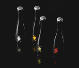
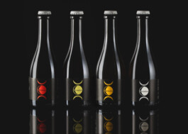
Sieman is renowned for its natural wine, originating from the Berici Hills in the north-east of Italy, near Vicenza. However, in recent years, they’ve expanded their offerings to include beer production during the winter months, the only period when the vineyard and wine production are not in full swing. Their beer lineup consists of four varieties inspired by the ancient tradition of spontaneously fermented beers passed down by the esteemed brewers of Belgium. Production occurs exclusively in winter, leveraging the colder temperatures to facilitate spontaneous fermentation with indigenous yeasts from the local area.
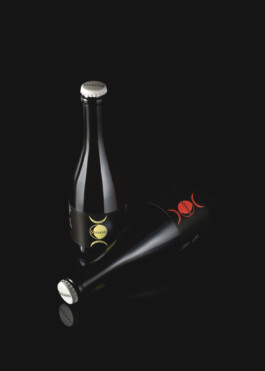
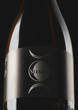
The design concept draws inspiration from the lunar phases, with a particular emphasis on the symbolism of the moon’s winter phase. For centuries, lunar phases have played a fundamental role in the connection between the earth and agricultural products. For Sieman, this connection underscores the importance of following the seasons, particularly during the fermentation period of these particular beers, in Winter.
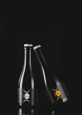
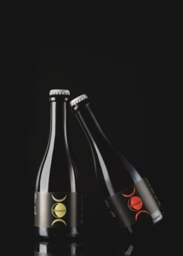
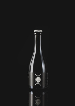
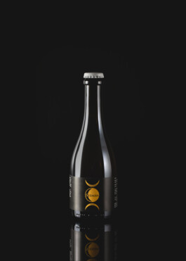
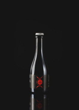
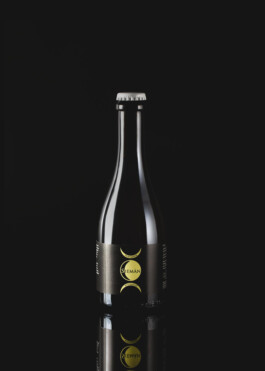
The logo & the typography are seamlessly integrated into the design, harmonizing with the moon illustrations to create a vibrant yet minimalist and bold aesthetic.
Each moon’s color corresponds to the flavor profile of the respective beer. Additionally, the choice of a black background serves to accentuate both the night sky and the premium quality of these beers.


Siéman Beer
BrandingPackaging
_
Role: Creative Director & Designer
Year: 2023
I designed labels for Sièman’s seasonal beer lineup, inspired by the lunar phases and spontaneous fermentation traditions.
Read more +
Sieman is renowned for its natural wine, originating from the Berici Hills in the north-east of Italy, near Vicenza. However, in recent years, they’ve expanded their offerings to include beer production during the winter months, the only period when the vineyard and wine production are not in full swing. Their beer lineup consists of four varieties inspired by the ancient tradition of spontaneously fermented beers passed down by the esteemed brewers of Belgium. Production occurs exclusively in winter, leveraging the colder temperatures to facilitate spontaneous fermentation with indigenous yeasts from the local area.
The design concept draws inspiration from the lunar phases, with a particular emphasis on the symbolism of the moon’s winter phase. For centuries, lunar phases have played a fundamental role in the connection between the earth and agricultural products. For Sieman, this connection underscores the importance of following the seasons, particularly during the fermentation period of these particular beers, in Winter.

The logo & the typography are seamlessly integrated into the design, harmonizing with the moon illustrations to create a vibrant yet minimalist and bold aesthetic.
Each moon’s color corresponds to the flavor profile of the respective beer. Additionally, the choice of a black background serves to accentuate both the night sky and the premium quality of these beers.
