Enter
BrandingDigital
_
Role: Designer
Year: 2016
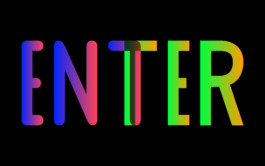
Branding for ENTER. Performing arts festival about the connection between art, humans and technology in Italy. I used human proportions for composing the grid on which the logotype is built.
EN with rounded corners aims to represent the humans while ER with sharp corners aims to represent technology.
The T is the union between them.


